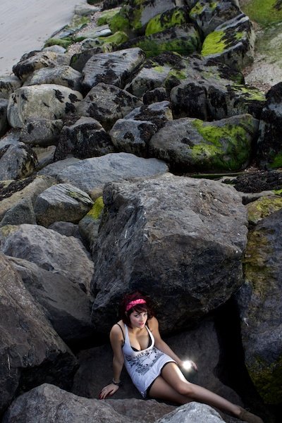
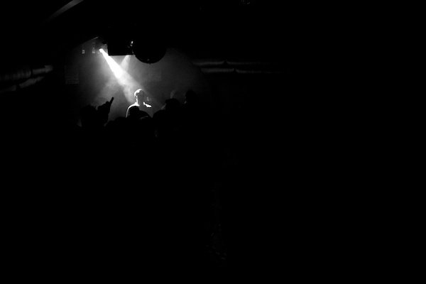
If you’re going to have your single point of interest in the center, it helps to make sure that the surrounding area is still interesting to look at. Positioning like this often seems boring but it doesn’t have to be. Central positioning brings a strong sense of balance to the photo as there is equal weight on either side of the subject. Here’s a similar photo, again of a person, but this time with surrounding detail to make the photo interesting. Placing your point of interest slightly off center creates a more dynamic photo with varying degrees of interest, depending on what you do with the rest of the frame. In an ideal world, we’d be able to move the subject around the frame as we wish to add more interesting elements. Often, however, there will be constraints from where we’re shooting that will prevent this. Simply putting someone slightly off center will make a massive difference. But only if you have justification for doing so, such as a more interesting background. When you place the single point close to the edge of the frame, you need to be more careful about the placement. The further out you go, the more unusual it will appear. It helps if the rest of the frame is interesting but for different reasons. These are generally much more powerful photos with the power to evoke thoughts and feelings better than centrally positioned photos. They are, however, to be used with caution. Over-doing this effect will leave your photos feeling boring and uninspired – less is more. Have a look at the photo below. I wanted to express the feeling of aloneness in a great expanse. I included a large amount of water and a single boat way off to the edge of the photo. It conveys the feeling exactly as I desired, turning an otherwise boring photo into an interesting one. When you’re trying to decide exactly where to place the point within your frame, let your natural instinct dictate which position is best. Some areas will feel boring, some areas will feel unbalanced. You can use the feeling of unbalance to your advantage though. It’s one of a long list of emotions that you can evoke with photography. If it works for the sort of photo you’re looking for, that’s a good thing. I wanted the photo below to be unbalanced due to the precarious nature of the rocks that I was standing on. The model situated at the bottom of the frame draws your eyes all the way down the frame which is already less balanced by its vertical orientation. The photo is not straight. It’s hard to tell without a horizon. And I wanted the viewer to be confused as to why the photo appeared so unbalanced, adding to the effect. A point of interest has to contrast with the rest of the frame in some way. That can be in size, color, tone or shape. There is no greater contrast in color than that of black and white, especially true in the photo below. The photo wasn’t cropped or Photoshopped to add a large amount of black area. It was just the nature of the lighting in the club when I took that photo. The obvious crowd gives a feeling of depth and the lighting is dramatic. But we’re just as drawn to the blank space as we are to the white detail. Our curiosity makes us explore the photo. Where you choose to place a single point in a frame is entirely up to you. Hopefully, now you will be aware of the implications of this placement. Just remember, there are no rules to photography, only guides; take any education on composition with a pinch of salt. Check out our article of understanding vantage point in photography next!


