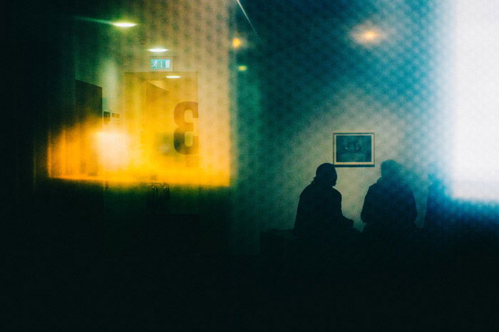
In this article, we’ll have a look at portrait vs landscape orientations. We’ll see where they’re used in photography, and when to choose one over the other.
Portrait vs Landscape Orientation in Photography
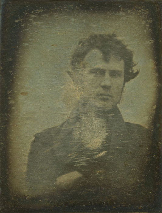
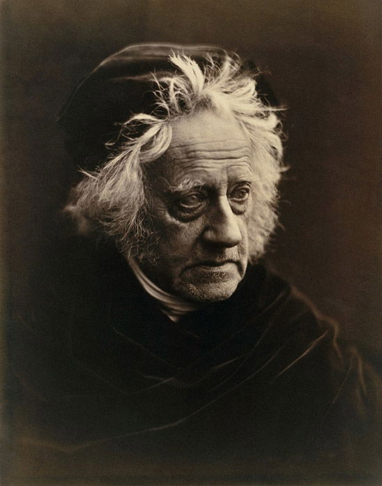
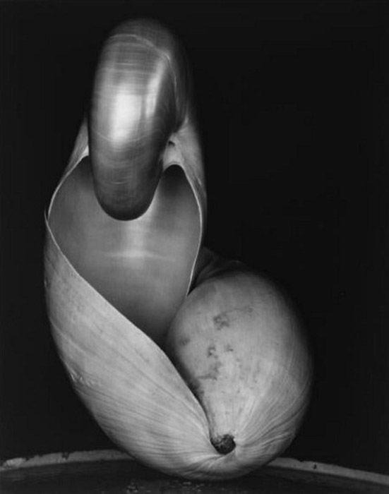
Robert Cornelius took the first intentional portrait of a human. He was both the subject and photographer. Yep, the first portrait was a selfie. Cornelius took his image in portrait orientation. From there, photography became important for documenting subjects. Both the portrait and landscape orientations were popular. Look at the works of Peter Henry Emerson, William Henry Jackson and Carleton Watkins. These famous landscape photographers used both portrait and landscape formats. In the studio, photographers like Julia Margaret Cameron, Gertrude Kasebier and Mathew Brady preferred the portrait orientation. This matched well with the dimensions of the human body. Photographers like Imogen Cunningham took portraits and still lifes characterised by intricate tonality. Edward Weston photographed a variety of subjects with unexpected camera orientations. Henri Cartier-Bresson’s masterful street photographs included both portrait and landscape formats. Photography today sees photographers move between portrait and landscape orientations with ease. Whether in their Instagram feeds or photo galleries, you can find a variety of styles. Hendrik Kerstens uses portrait orientations in his ethereal depictions of human subjects. Cindy Sherman also makes extensive use of the portrait format. She explores the visual exchange between the sitter and the viewer. Kim Keever and Wolfgang Tillmans have photographed their subjects in both portrait and landscape orientations. Each uses the dimensions of the abstraction to dictate the image format. Bill Henson often works within a landscape format. He uses generous amounts of dark, negative space. And Annie Leibovitz uses a mix of portrait and landscape orientated portraits. Her choice depends on context, narrative and creative process.
Making the Choice – Landscape and Format Orientations
So what can we learn from the historic use of landscape and portrait orientations in art? There are many things to consider when choosing between portrait or landscape. These include subject dimensions, cropping, emphasis, formality, and final presentation. It sounds like a lot. But once you familiarise yourself with the concepts, the decision becomes much clearer.
Subject Dimension
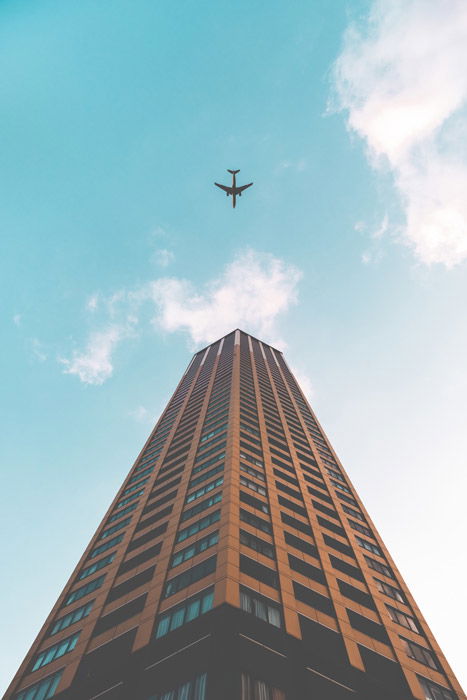
Adjusting the camera orientation to fit a subject has become almost instinctual. This is the beauty of modern photography. Keep in mind the dimensions of your subject. This will allow you to make informed choices about image format. The portrait orientation allows you to photograph vertical subjects in full. You can capture horizontal ones in their entirety with the use of the landscape format.
Cropping
Changing the image orientation is a way to crop out undesirable elements in a photograph. You can do this either in-camera or in post-processing. Changing from a portrait to a landscape orientation adjusts the flow of a photograph. It removes superfluous vertical aspects. Going from a landscape to a portrait format creates a sense of formality within a photograph. You can use it to narrow in on a particular concept or subject.
Emphasis
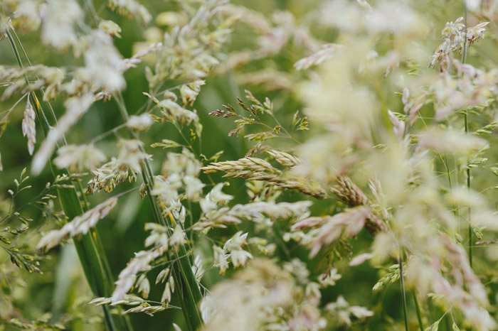
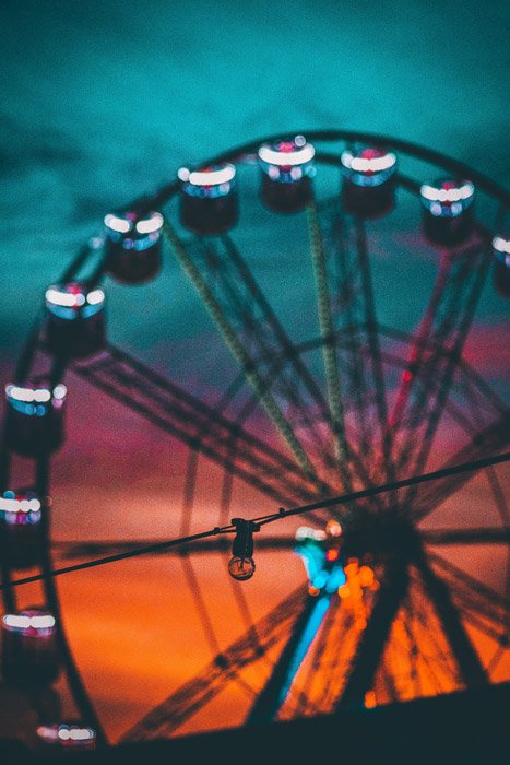
The orientation of a photograph can reinforce your subject. It tells the viewer what should take visual priority within in an image. Lines, shapes and forms behave differently under the emphasis of differing orientations. A landscape format creates space, highlighting horizontal elements within a photograph. A portrait orientation is restrained and upright, invigorating vertical elements. Choose a format that fits your subject’s qualities. This will create a harmonious image. An orientation that opposes the flow of the image can create visual tension. This can stimulate energetic visual movement. It’s a great technique to use if you want to create drama.
Formality
Formality defines the perceived rigidity of a photograph. A formal image is read with a tendency towards the academic. It evokes impressions of a precise, systematic formula. A landscape image is more fluid and flexible, leaving a viewer to consume an image at their own pace. Both ends of the scale have roots in their predominant usage throughout history. The portrait orientation evokes impressions of height, portraiture, and prestige. Landscape orientations bring to mind swaths of landscape imagery, rest and space. It can convey impressions of relaxation, rhythm, and immersion.
Presentation
You might be presenting your image digitally or in print. Orientation will impact the way viewers look at your image. If you plan on hanging your photography, the first aspect to consider is available room. Will the portrait/landscape image you are photographing fit in the desired location? If not, you may need to alter your orientation. Presenting images in a single orientation creates order and fluidity. Mixing landscape and portrait orientations together can appear spontaneous and energetic.
Conclusion
From the beginning of photography, photographers have been using image format as a tool. It allows them to expand upon the confines of the fixed image. Take subject dimension, cropping, emphasis, formality and final presentation into account. This will help you select the most appropriate image format and easily choose between portrait vs landscape format. It’ll reinforce your imagery with informed compositional choices. Looking for more tips on photo composition? Check out our article on how to use focal points in photography composition next!


title: “Portrait Vs Landscape When Should You Use Each " ShowToc: true date: “2023-01-11” author: “Ruth Pyle”
In this article, we’ll have a look at portrait vs landscape orientations. We’ll see where they’re used in photography, and when to choose one over the other.
Portrait vs Landscape Orientation in Photography
Robert Cornelius took the first intentional portrait of a human. He was both the subject and photographer. Yep, the first portrait was a selfie. Cornelius took his image in portrait orientation. From there, photography became important for documenting subjects. Both the portrait and landscape orientations were popular. Look at the works of Peter Henry Emerson, William Henry Jackson and Carleton Watkins. These famous landscape photographers used both portrait and landscape formats. In the studio, photographers like Julia Margaret Cameron, Gertrude Kasebier and Mathew Brady preferred the portrait orientation. This matched well with the dimensions of the human body. Photographers like Imogen Cunningham took portraits and still lifes characterised by intricate tonality. Edward Weston photographed a variety of subjects with unexpected camera orientations. Henri Cartier-Bresson’s masterful street photographs included both portrait and landscape formats. Photography today sees photographers move between portrait and landscape orientations with ease. Whether in their Instagram feeds or photo galleries, you can find a variety of styles. Hendrik Kerstens uses portrait orientations in his ethereal depictions of human subjects. Cindy Sherman also makes extensive use of the portrait format. She explores the visual exchange between the sitter and the viewer. Kim Keever and Wolfgang Tillmans have photographed their subjects in both portrait and landscape orientations. Each uses the dimensions of the abstraction to dictate the image format. Bill Henson often works within a landscape format. He uses generous amounts of dark, negative space. And Annie Leibovitz uses a mix of portrait and landscape orientated portraits. Her choice depends on context, narrative and creative process.
Making the Choice – Landscape and Format Orientations
So what can we learn from the historic use of landscape and portrait orientations in art? There are many things to consider when choosing between portrait or landscape. These include subject dimensions, cropping, emphasis, formality, and final presentation. It sounds like a lot. But once you familiarise yourself with the concepts, the decision becomes much clearer.
Subject Dimension
Adjusting the camera orientation to fit a subject has become almost instinctual. This is the beauty of modern photography. Keep in mind the dimensions of your subject. This will allow you to make informed choices about image format. The portrait orientation allows you to photograph vertical subjects in full. You can capture horizontal ones in their entirety with the use of the landscape format.
Cropping
Changing the image orientation is a way to crop out undesirable elements in a photograph. You can do this either in-camera or in post-processing. Changing from a portrait to a landscape orientation adjusts the flow of a photograph. It removes superfluous vertical aspects. Going from a landscape to a portrait format creates a sense of formality within a photograph. You can use it to narrow in on a particular concept or subject.
Emphasis
The orientation of a photograph can reinforce your subject. It tells the viewer what should take visual priority within in an image. Lines, shapes and forms behave differently under the emphasis of differing orientations. A landscape format creates space, highlighting horizontal elements within a photograph. A portrait orientation is restrained and upright, invigorating vertical elements. Choose a format that fits your subject’s qualities. This will create a harmonious image. An orientation that opposes the flow of the image can create visual tension. This can stimulate energetic visual movement. It’s a great technique to use if you want to create drama.
Formality
Formality defines the perceived rigidity of a photograph. A formal image is read with a tendency towards the academic. It evokes impressions of a precise, systematic formula. A landscape image is more fluid and flexible, leaving a viewer to consume an image at their own pace. Both ends of the scale have roots in their predominant usage throughout history. The portrait orientation evokes impressions of height, portraiture, and prestige. Landscape orientations bring to mind swaths of landscape imagery, rest and space. It can convey impressions of relaxation, rhythm, and immersion.
Presentation
You might be presenting your image digitally or in print. Orientation will impact the way viewers look at your image. If you plan on hanging your photography, the first aspect to consider is available room. Will the portrait/landscape image you are photographing fit in the desired location? If not, you may need to alter your orientation. Presenting images in a single orientation creates order and fluidity. Mixing landscape and portrait orientations together can appear spontaneous and energetic.
Conclusion
From the beginning of photography, photographers have been using image format as a tool. It allows them to expand upon the confines of the fixed image. Take subject dimension, cropping, emphasis, formality and final presentation into account. This will help you select the most appropriate image format and easily choose between portrait vs landscape format. It’ll reinforce your imagery with informed compositional choices. Looking for more tips on photo composition? Check out our article on how to use focal points in photography composition next!

