However, many photographers, including myself, don’t like Lightroom Classic. It’s fair to say that while adding more and more features throughout the years, Adobe has been reluctant to optimize the program. The current version is quite hard to like (for me, at least). It has a cluttered and unresponsive interface, and often too many unnecessary features. That’s one of the reasons why Adobe introduced Lightroom CC a few years ago. This piece of software is designed for the cloud era, primarily for enthusiasts. It offers all the base features of Lightroom Classic in a more streamlined, lighter, and faster application. Let’s see if you should try it.
Overview of Lightroom CC
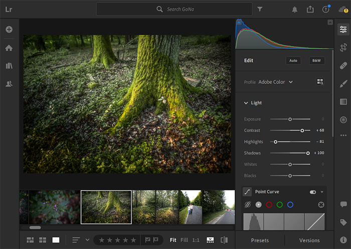
Lightroom CC was introduced in 2017 when Adobe decided to split up Lightroom into two separate applications. Lightroom Classic has been kept as a photo processing and management workstation for use on desktop computers. Lightroom CC offers extensive mobile and tablet support (besides desktop). It also has cloud sync, and a brand new interface, with slightly limited functionality. It’s important to note that you don’t have to choose between the two. Both are available in Adobe’s Photography Plan, and you can use them simultaneously. As a hint to the verdict, I find it a great tool for managing and editing my off-work photography, as well as smaller jobs. But it has limitations that make it difficult for professional use.
Adobe Lightroom CC interface” width=”700″ height=”498″ />
Who Is Lightroom CC For?
The target audience for Lightroom CC is fairly well definable. Anyone who doesn’t need extensive import/export tools and plugin compatibility has a high chance of being better off with Lightroom CC. It’s especially useful for photographers who shoot a lot on the run, like street or documentary photographers. Cloud synchronisation is a feature I didn’t really know I needed before starting to use CC, but I’ve been loving it ever since.
Price
Lightroom CC is available as part of various subscription packages by Adobe. The cheapest of these is the Photography Plan. This costs $10/month in the US, and €13 in the EU. In the Photography Plan, there is 20GB of cloud storage included, as well as access to Photoshop. For an additional $10/month, you get 1TB of storage, which will be plenty if you filter your images properly.
Compatibility
Lightroom CC is available on all platforms. It has desktop applications for Windows and Mac, and mobile/tablet applications on both Android and iOS. Furthermore, it’s also available from your browser, albeit it’s quite sluggish there. It’s not a hardware-intensive program, much less so than Lightroom Classic itself. This is because it was newly designed from scratch a few years ago. Classic, on the other hand, has been around for more than two decades, and it was never entirely redesigned.
Key Features
Non-Destructive Workflow
Like most advanced editing software today, Lightroom CC is non-destructive as well. This means that your original image files are kept unmodified throughout the editing process. Changes made to images are saved separately, in case of the Lightroom CC to the cloud. You can revert to the original image or make a new edit at any point during editing.
Interface
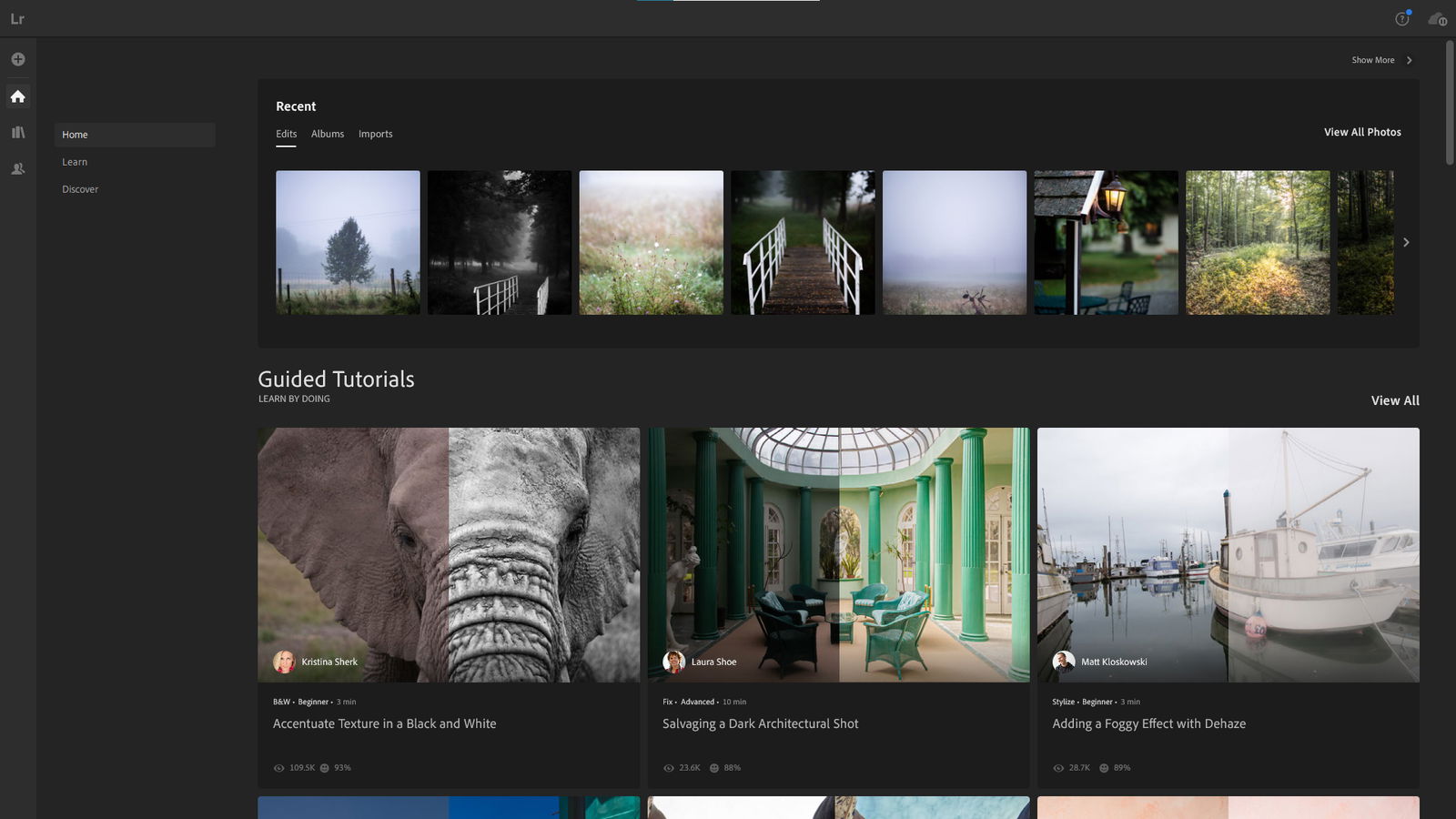
The user interface of Lightroom CC is clean and responsive, in stark contrast to the Classic version. It has three main segments: Home, Library, and Sharing. Of these, I haven’t found much use for the Home panel. It’s just a summary of what you’ve edited recently, and also has tutorial videos and guided tours of the software. Sadly, there’s no way I’ve found to turn these off. It seems like Lightroom CC is currently tailored more towards beginners, even though its functionality enables otherwise. This is also apparent in the smartphone version, where three-quarters of the bottom bar is occupied by non-editing related functions. The Library panel is where all the action happens. You’ll find your imported images here, as well as your editing options. You can create albums and filters for better management. The Sharing panel has all albums and images you’ve shared. In terms of shortcuts, Lightroom CC is almost identical to Lightroom Classic.Adobe Lightroom CC interface” width=”700″ height=”394″ />
Editing Tools
If you’re familiar with Lightroom Classic, the basic editing toolkit will be very familiar. You have the same tools in similar grouping, which are the following:
Light (Exposure, Contrast, Highlights, Shadows, Whites, Blacks, Curve). Color (Temperature, Tint, Vibrance, Saturation, HSL mixer with color pick). Effects (Texture, Clarity, Dehaze, Vignette, Grain, Split Toning without color pick). Detail (Sharpening + options, Noise Reduction + options, Color Noise Reduction + options) Optics (Chromatic Aberration + Defringe options, Lens Corrections, Geometry).
You can crop and rotate your images with the crop tool. This tool allows you to set specific aspect ratios, but you can’t put in custom ratios. The well-known local adjustments (radial, gradual, and brush) are also available, as well as the healing and cloning tools. The Calibration menu is missing, but you can choose and import profiles. By default, Adobe’s own standardised color profiles are selected. If you have a supported camera (basically any DSLR, mirrorless, and advanced point-and-shoot model on the market), you can also choose a camera-matching profile. This is the same as if you’d choose the profile in the camera. A powerful feature that both Lightroom versions offer is presets. You can make your own or import presets (like any of ours). This can really speed up your editing process. Lightroom’s dominant place on the editing software market ensures that there are thousands of presets and preset packs available, free or paid.
Management Tools
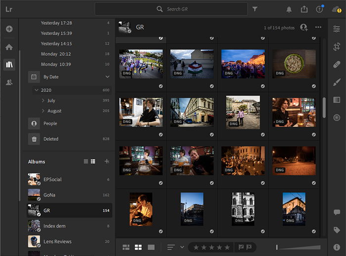
Here, Lightroom CC starts to significantly diverge from the Classic version. Whereas Classic allows you to create catalogs and stacks, there are no such things in CC. Instead, everything is stored in the cloud, with offline cache and the option to import offline-only. You can create albums, and filter for images based on date, camera model, rating, and more. Lightroom CC also has a face detection feature (you need to enable it manually for privacy reasons), and you can filter for faces too.
Adobe Lightroom CC interface” width=”700″ height=”518″ />
Smartphone App
One of the reasons I really like Lightroom CC for my personal use case is that it has a fully-fledged smartphone app. All the aforementioned tools and options are available from my phone. I use it a lot for my street and event photography, primarily with my Ricoh GR III, but also with my DSLRs occasionally. I copy the images from the camera onto my smartphone either via Wi-Fi or a card reader. Then, I import the photos into Lightroom CC and start editing. After a short while, I have an edit ready to be shared if I choose to. And the next time I open up Lightroom on my desktop, the image and its edits are there, in original quality. The smartphone interface is a little bit cluttered, but that’s necessary to keep all the functionality of the desktop version available.
Browser Access and Sharing
For the first time in the history of advanced editing software, Lightroom CC is available from your browser as well. To be fair, it’s slow (because of raw file sizes), and quite unresponsive, but it at least exists. This is very useful. Even if I don’t have any of my own devices at hand, I can still access my library, make edits, and export. Also, you can share images directly through the Lightroom CC web app. You can create a web gallery out of any album you have in your library, which is ready to share. You don’t need to export and reupload to another sharing website.
Alternatives
As a multi-platform editing and photo management suite, Lightroom CC currently has no direct competition. Lightroom Classic CC, the original version, is probably better for you if you’re working with huge catalogs and need more extensive batching, filtering, and importing options.
Our Verdict
Lightroom CC is an excellent application, with a few non-fatal flaws. I’d love it if it was slightly more customizable (allowing to remove tutorials, for instance). But overall, this application is an excellent choice for a large audience of photographers. It surpasses Lightroom Classic in practicality for many use cases. Check out subscription options here on Adobe’s website. You can learn all the secrets of editing in Lightroom with our Effortless Editing course! —


title: “Lightroom Cc Review 2023 Do You Need It " ShowToc: true date: “2023-02-08” author: “John Carpenter”
However, many photographers, including myself, don’t like Lightroom Classic. It’s fair to say that while adding more and more features throughout the years, Adobe has been reluctant to optimize the program. The current version is quite hard to like (for me, at least). It has a cluttered and unresponsive interface, and often too many unnecessary features. That’s one of the reasons why Adobe introduced Lightroom CC a few years ago. This piece of software is designed for the cloud era, primarily for enthusiasts. It offers all the base features of Lightroom Classic in a more streamlined, lighter, and faster application. Let’s see if you should try it.
Overview of Lightroom CC
Lightroom CC was introduced in 2017 when Adobe decided to split up Lightroom into two separate applications. Lightroom Classic has been kept as a photo processing and management workstation for use on desktop computers. Lightroom CC offers extensive mobile and tablet support (besides desktop). It also has cloud sync, and a brand new interface, with slightly limited functionality. It’s important to note that you don’t have to choose between the two. Both are available in Adobe’s Photography Plan, and you can use them simultaneously. As a hint to the verdict, I find it a great tool for managing and editing my off-work photography, as well as smaller jobs. But it has limitations that make it difficult for professional use.
Adobe Lightroom CC interface” width=”700″ height=”498″ />
Who Is Lightroom CC For?
The target audience for Lightroom CC is fairly well definable. Anyone who doesn’t need extensive import/export tools and plugin compatibility has a high chance of being better off with Lightroom CC. It’s especially useful for photographers who shoot a lot on the run, like street or documentary photographers. Cloud synchronisation is a feature I didn’t really know I needed before starting to use CC, but I’ve been loving it ever since.
Price
Lightroom CC is available as part of various subscription packages by Adobe. The cheapest of these is the Photography Plan. This costs $10/month in the US, and €13 in the EU. In the Photography Plan, there is 20GB of cloud storage included, as well as access to Photoshop. For an additional $10/month, you get 1TB of storage, which will be plenty if you filter your images properly.
Compatibility
Lightroom CC is available on all platforms. It has desktop applications for Windows and Mac, and mobile/tablet applications on both Android and iOS. Furthermore, it’s also available from your browser, albeit it’s quite sluggish there. It’s not a hardware-intensive program, much less so than Lightroom Classic itself. This is because it was newly designed from scratch a few years ago. Classic, on the other hand, has been around for more than two decades, and it was never entirely redesigned.
Key Features
Non-Destructive Workflow
Like most advanced editing software today, Lightroom CC is non-destructive as well. This means that your original image files are kept unmodified throughout the editing process. Changes made to images are saved separately, in case of the Lightroom CC to the cloud. You can revert to the original image or make a new edit at any point during editing.
Interface
The user interface of Lightroom CC is clean and responsive, in stark contrast to the Classic version. It has three main segments: Home, Library, and Sharing. Of these, I haven’t found much use for the Home panel. It’s just a summary of what you’ve edited recently, and also has tutorial videos and guided tours of the software. Sadly, there’s no way I’ve found to turn these off. It seems like Lightroom CC is currently tailored more towards beginners, even though its functionality enables otherwise. This is also apparent in the smartphone version, where three-quarters of the bottom bar is occupied by non-editing related functions. The Library panel is where all the action happens. You’ll find your imported images here, as well as your editing options. You can create albums and filters for better management. The Sharing panel has all albums and images you’ve shared. In terms of shortcuts, Lightroom CC is almost identical to Lightroom Classic.Adobe Lightroom CC interface” width=”700″ height=”394″ />
Editing Tools
If you’re familiar with Lightroom Classic, the basic editing toolkit will be very familiar. You have the same tools in similar grouping, which are the following:
Light (Exposure, Contrast, Highlights, Shadows, Whites, Blacks, Curve). Color (Temperature, Tint, Vibrance, Saturation, HSL mixer with color pick). Effects (Texture, Clarity, Dehaze, Vignette, Grain, Split Toning without color pick). Detail (Sharpening + options, Noise Reduction + options, Color Noise Reduction + options) Optics (Chromatic Aberration + Defringe options, Lens Corrections, Geometry).
You can crop and rotate your images with the crop tool. This tool allows you to set specific aspect ratios, but you can’t put in custom ratios. The well-known local adjustments (radial, gradual, and brush) are also available, as well as the healing and cloning tools. The Calibration menu is missing, but you can choose and import profiles. By default, Adobe’s own standardised color profiles are selected. If you have a supported camera (basically any DSLR, mirrorless, and advanced point-and-shoot model on the market), you can also choose a camera-matching profile. This is the same as if you’d choose the profile in the camera. A powerful feature that both Lightroom versions offer is presets. You can make your own or import presets (like any of ours). This can really speed up your editing process. Lightroom’s dominant place on the editing software market ensures that there are thousands of presets and preset packs available, free or paid.
Management Tools
Here, Lightroom CC starts to significantly diverge from the Classic version. Whereas Classic allows you to create catalogs and stacks, there are no such things in CC. Instead, everything is stored in the cloud, with offline cache and the option to import offline-only. You can create albums, and filter for images based on date, camera model, rating, and more. Lightroom CC also has a face detection feature (you need to enable it manually for privacy reasons), and you can filter for faces too.
Adobe Lightroom CC interface” width=”700″ height=”518″ />
Smartphone App
One of the reasons I really like Lightroom CC for my personal use case is that it has a fully-fledged smartphone app. All the aforementioned tools and options are available from my phone. I use it a lot for my street and event photography, primarily with my Ricoh GR III, but also with my DSLRs occasionally. I copy the images from the camera onto my smartphone either via Wi-Fi or a card reader. Then, I import the photos into Lightroom CC and start editing. After a short while, I have an edit ready to be shared if I choose to. And the next time I open up Lightroom on my desktop, the image and its edits are there, in original quality. The smartphone interface is a little bit cluttered, but that’s necessary to keep all the functionality of the desktop version available.
Browser Access and Sharing
For the first time in the history of advanced editing software, Lightroom CC is available from your browser as well. To be fair, it’s slow (because of raw file sizes), and quite unresponsive, but it at least exists. This is very useful. Even if I don’t have any of my own devices at hand, I can still access my library, make edits, and export. Also, you can share images directly through the Lightroom CC web app. You can create a web gallery out of any album you have in your library, which is ready to share. You don’t need to export and reupload to another sharing website.
Alternatives
As a multi-platform editing and photo management suite, Lightroom CC currently has no direct competition. Lightroom Classic CC, the original version, is probably better for you if you’re working with huge catalogs and need more extensive batching, filtering, and importing options.
Our Verdict
Lightroom CC is an excellent application, with a few non-fatal flaws. I’d love it if it was slightly more customizable (allowing to remove tutorials, for instance). But overall, this application is an excellent choice for a large audience of photographers. It surpasses Lightroom Classic in practicality for many use cases. Check out subscription options here on Adobe’s website. You can learn all the secrets of editing in Lightroom with our Effortless Editing course! —


